Municipality of Waalwijk – Dashboards for their social domains
Waalwijk wanted to get a better grip on the Social Domain. Costs are rising and there is a strong need for insights into the quantities and costs related to the use of services in the Social Domain. TWIJZ therefore wanted to work more data-driven: using data to gain better and faster insight and to make forecasts, to provide up-to-date management options.

Their Challenge
The Municipality of Waalwijk works within the Social Domain with various (sub) dashboards and management reports. This makes the provision of information confusing, incomplete and not always up to date. This makes timely adjustments very difficult and inefficient. Therefore, we aim to combine the various data and information flows of both Youth Care and Social Services, including the financial status, into one overarching dashboard. Furthermore, although data-driven insights were lacking, the feeling was that waiting times for a social service to be provided increased tremendously over time, which had to be improved.
To provide these data-driven insights, dashboards were developed. The motto while creating these dashboards was: “Simple, yet effective.” The end users, employees within the social domain area, need a clear and concise overview of all necessary data.

Our Solution
The dashboards that were built, allow the municipality of Waalwijk to be more data-driven. Our approach puts the end user first (using simple, yet effective dashboards) and works towards a culture that has a data-driven mindset. The solution is all about being able to support the users to make decisions based on data and intuition, rather than intuition alone.
We adopted an iterative approach to developing these dashboards. Initially, KPIs were provided by the municipality of Waalwijk which we visualised. For this, some data preparation was necessary which we were also responsible for. Once these KPIs were visualised, either new KPIs emerged due to the visualisations providing new insights, or the conclusion was that these KPIs did not capture the information necessary to make better decisions. This was a. back-and-forth between the municipality and the developers, where each iteration improved upon the previous.
Result
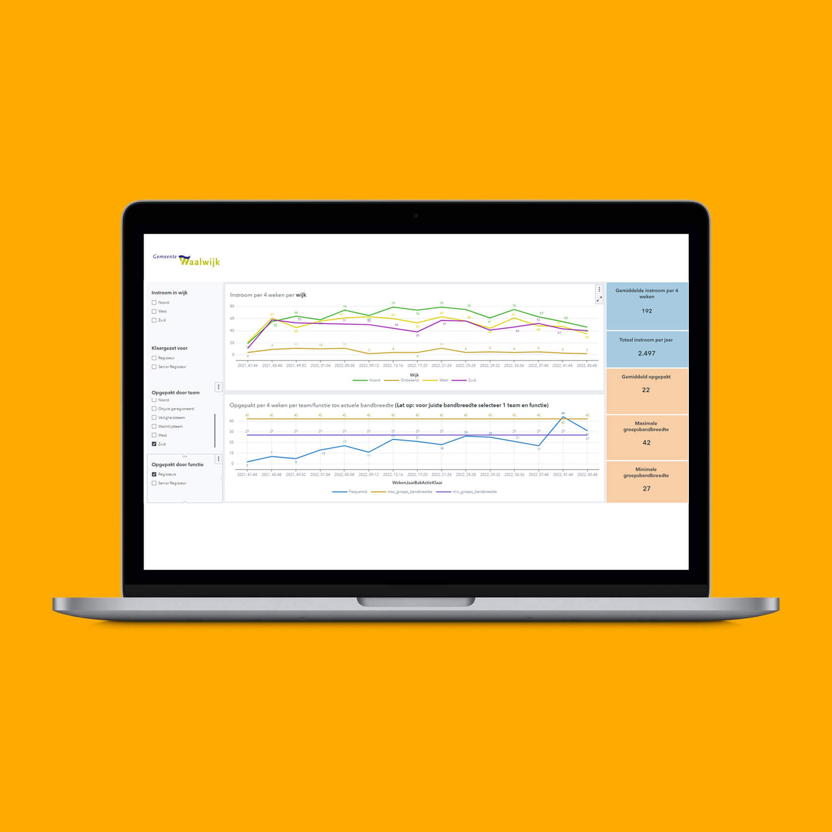
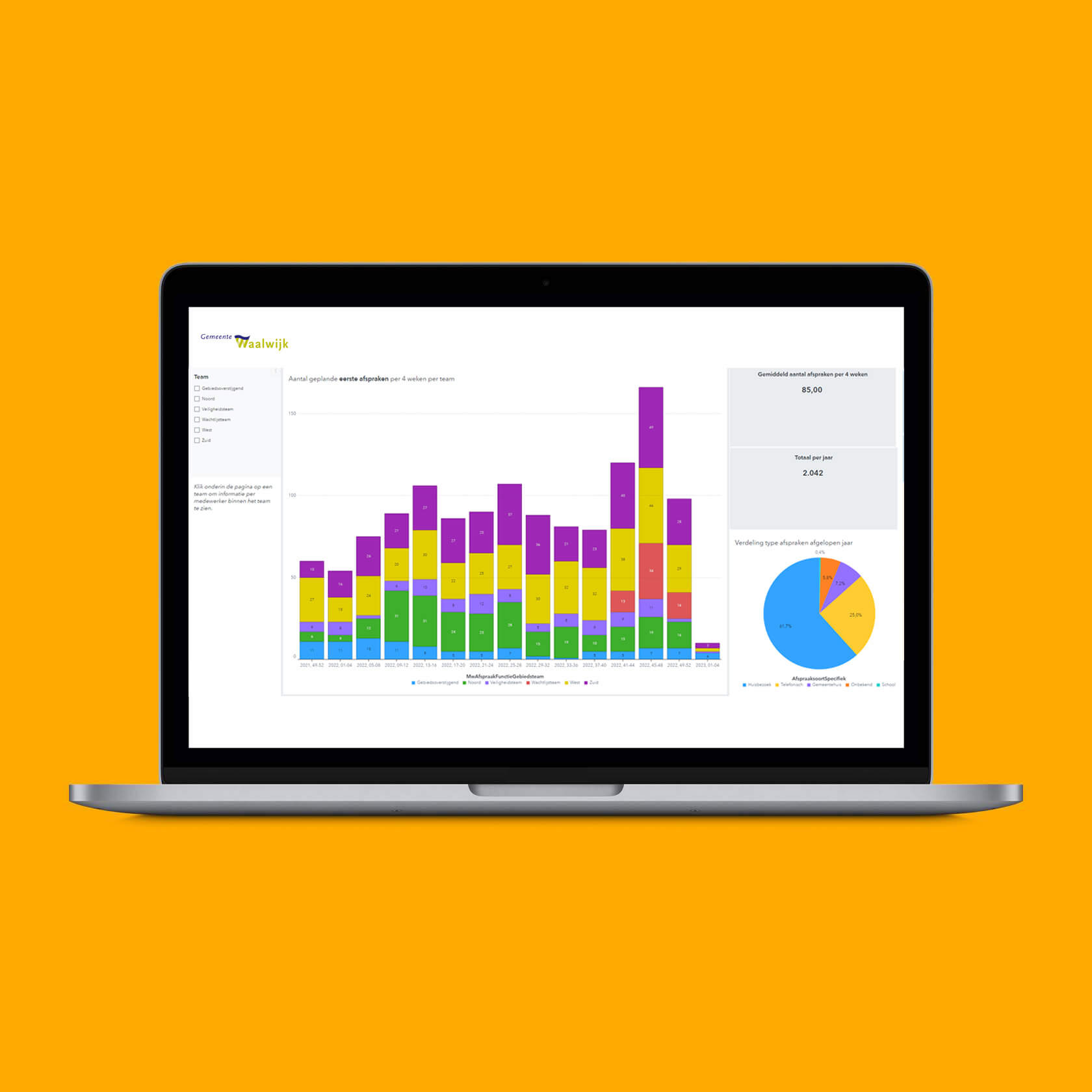
From a technology perspective, the SAS platform was used. SAS provides flexible dashboards where all insights are in one place, as well as tools for data preparation. It has many out-of-the-box functionalities, which allowed us to quickly implement the dashboards. After a couple of iterations, which were discussed with users, the dashboards were ready to be used. Visualisations include for example the amount of historically requested social services, as well as drill-downs into type, neighbourhood, age, and much more. Furthermore, the total lead time from the initial request to actually provided service was visualised over time. These visualisations provided the municipality with much-needed information, as they can use this to plan the necessary resource allocation to handle the requests.