Modern CSS grid solutions to
common layout problems
Within CSS, layout and composition are challenging topics to resolve. Our Senior Software Engineer, Kevin Pennekamp, will discuss these challenges and shares solutions to tackle these challenges.
07-2020
Layout and composition are some of the most challenging topics within CSS. Especially when you have to take responsiveness into account. We often fall back on media-queries. But adding many media-queries for various breakpoints can make your CSS unmaintainable. But with the addition of grids, we can overcome media-query fatigue. Not only make our CSS more maintainable, but they also improve the user experience. We can let CSS handle the available space. In this article, I will describe three layout implementations that can improve your (personal) website.
Dynamic centred layout
We all know margin: 0 auto to center a layout. Ideal for article pages, right? But what if you want elements like images to exceed the maximum width of the article? We can achieve this by working with negative margins. But this only works on big screens. On small screens, negative margins can break your website. Especially when you apply smaller side padding on mobile compared to tablets. So, we have to add many media-queries to ensure this effect works as intended, on all screen sizes. But now we have our cool effect as visualised below.
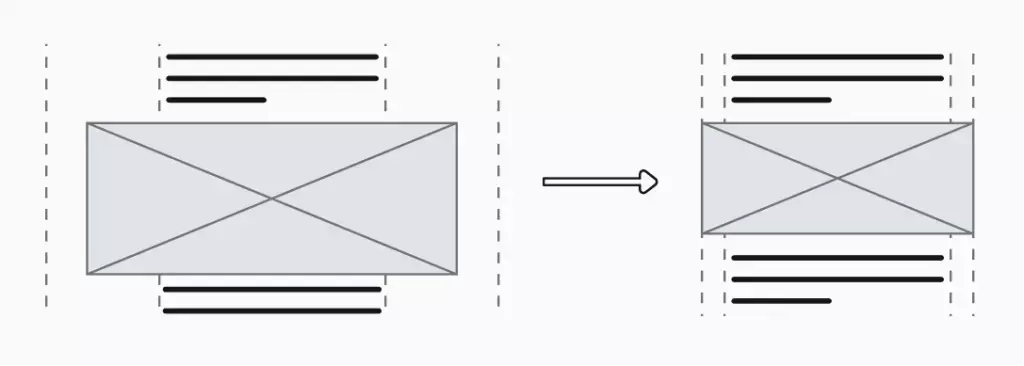
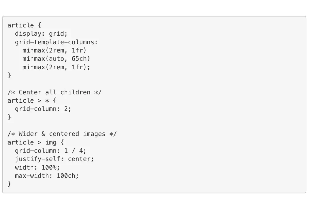
What happens when you want to change these ultra-wide elements? You go over several media-queries to determine if your change is applied on various screens. What if we could cut the media-queries and still achieve this effect? Recently I came across this post from Dave Geddes. It shows us how we can achieve this effect using CSS Grids. You create a grid of three columns. The center column is the actual content area, while the two outer columns act as padding, but also create the effect of margin: 0 auto.
The paddings on the side should differ on various screen sizes. On smaller screens, you want to limit the wasted space, while on bigger screens more padding can improve the visual quality. But with the above solution you still need media-queries to use different side padding. You could mitigate this by adding fluidity to your website. We can replace the 2rem with something like calc(1rem + 1 * var(–ratio)). By doing so, the side padding changes automatically when the screen size changes, without media-queries. Now we have a dynamic and maintainable layout for our articles.
Responsive multi-column grid system
Who does not know the responsive multi-column layout? A layout that changes the number of columns with the screen size as illustrated above. This was often solved using something like the Bootstrap grid-system, or an own implementation. But, this restricts you to a fixed number of columns for each screen size. If you would have five columns, that would not be possible in a twelve column system. Besides, you have to determine for each element the column span on different screen sizes.
If you have many grids, your CSS or HTML does not scale well. Luckily we have CSS grids these days. With CSS grids we do not define the column span for each element. Instead, we let the browser determine the number of columns on the screen. You can achieve the illustrated scalable layout with the code snippet below. Let’s dissect it!


This is the so called RAM pattern: repeat, auto, minmax. With repeat() we say to the browser that it needs to repeat its argument. For example, repeat(3, 1fr) would create a layout of three equally sized columns that fill the entire screen. But, our elements almost always have a minimum width. With the 1fr we can break them. With minmax(20rem, 1fr), each column has a minimum width of 20rem, but scales on larger screens.
The magic starts when replacing the fixed number with auto-fit or auto-fill. With both options, we let the browser determine the amount of available columns on the screen. When using auto-fill and minmax(20rem, 1fr) on a screen of 90rem the browser creates four columns. The auto-fit option creates a maximum of four columns in this example. When there are only two elements to put in the grid auto-fit reduces the number of columns to two. This gives you great flexibility in responsive layouts, without using media-queries.
Information:
Did you know that you can set a grid-column: span 2 attribute on your elements? When doing so, they will span two columns. So not all elements have to be the same size. The downside is that there will always be at least two columns, and any potential gaps in the grid are not filled.
Two-way card layouts
You often see big card layouts with an image and content next to each other, spanning a big horizontal space. Often they have a fixed ratio between them (e.g. 50%-50%). When reducing the screen size, you don’t want these two next, but below each other. The ratio also changed to make better use of the available space. The height of the image is not 50% anymore. The wireframes below visualise this concept.
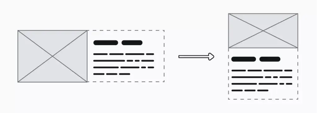
Does this not sound like a familiar problem? Well, it is. It is almost the same as the auto-scaling grid-layout I already described. There is one small addition. We need to add grid-template-rows: auto 1fr to the grid class example. The auto value accommodates the vertical orientation with a changed ratio. This assumes that the images have a landscape orientation. As there are only two child elements (the image and the content) CSS grids handle the rest.
Information:
In CSS grids, row and column definitions are ignored when there are not enough elements. In the above example, when there are only enough elements to fill the first row, the 1fr definition of the second row is ignored.
Conclusion
CSS grids enable you to solve responsive layout issues. There are ways to achieve the above, also without using media-queries. But in most cases they need more CSS to work, making those solutions more difficult to maintain. Especially when combined with fluidity CSS grids (and flex boxes) enable you to create websites that flow with the screen size, and not worry about breakpoints. I mean, they are called breakpoints
This article was originally posted on Vycke.

