Interfacing Your
UI Components
In recent years, front-end development became an important part of my life. But when I started years ago, I did not understand what an API was.

07-2019
I worked with them, but I never cared what it exactly was, or what it requires building one. I knew what the concept of interfaces in UI, but its relation with the letter “I” of API was lost to me. At a certain point, collaboration becomes more important. Your colleagues should be able to use and understand your work. This was the point for me I started to see the connection between API and UI in front-end development.
What is an interface?
As a front-end engineer, always take the reusability of your work into account. On the other end, our work should also be usable and accessible to users. Both concepts come together with the modern way of working, where design systems are at the center of attention.
As Alla Kholmatova describes in her book a design system comprises reusable patterns. But how do you make something reusable, especially when the content pattern itself is rather complex?
This is where the concept of interfaces come into play. The ever so trustworthy Wikipedia defines an interface as stated below.
“An interface is a shared boundary across which two or more separate components of a computer system exchange information”
When looking at this definition with my front-end goggles, I directly see the word component. Two or more separate UI components that work together is exactly how we create most design systems. In React for instance, you provide data from a parent component to a child component through the props of the child component. So is this the spot in front-end development where we design and develop interfaces? Put simply, yes it is.
The UI the user is interacting with is the shared boundary from the interface definition. The interactions of a user are a way of transferring information about his or her intentions towards our components.
Component anatomy
So we are dealing with two types of interfaces when designing and developing components. By combining multiple of these components we can create a UI that the user can use that connects to our system. Great! Are we done? Not completely. When we change something in one interface, it affects the other interface of the same component. To understand this better, we have to look at the component anatomy.
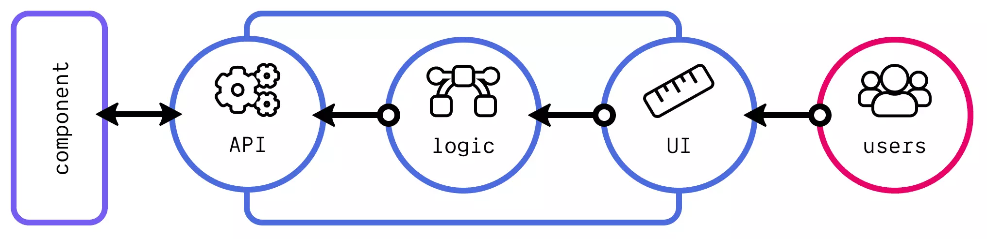
A UI component consists, as you can see, of several parts that interact with each other. When a user interacts with the UI by clicking a button, some logic triggers inside the component. Depending on the logic, several things can happen within the component. The internal state of the component gets updated, we send a request to the back end, or we provide information back to the user. One important path inside the component is missing though. Through its API, it can provide information to other components. This only works when other components connect to your component, by providing a callback function (e.g. an onClick function for a button component).
Your component can provide information to others through their APIs, and vice versa. Another component can provide information through the API to your component. This is the interface used by other engineers. Our components runs some logic when another connects through the API. Depending on the logic, it either updates its internal state, provides information back, or update the UI based on the information.
In the last case, it is our component that describes in its API how it can connect with other components. It describes what type of information it can receive, but also when it can provide information back (e.g. callback functions like onClick). We can often assume that other engineers are not aware of the internals of our UI components. So the interfaces become a way to describe how we want others to use and interact with our work. But how can we describe our interfaces to ensure others know of how they should interact with them?
The interfaces become a way to describe how we want others to use and interact with our work
Describing interfaces
This problem is partly already solved for your users with proper design. Providing good visual queues to the user so they know where and how they can interact with your component is a good first step. A second step lives within implementing the designs. Not every user interacts with a UI the way you envision. This can have various reasons, but a big one can be disabilities. When a user is partly blind, he or she might use a screen reader to interact with your component. The design of the UI does not have to change, but on an implementation level, consider these use cases. This is called the field of accessibility (or a11y).
In the rest of this post, however, I want to discuss the engineers’ interface or the API. Describing how we want other engineers to interact with our UI component is not a trivial task. As an engineer, myself included, we often have the feeling that our work is self-explanatory. It is not.
- What APIs of our UI component do they have access to;
- For each API, how they can use it and what its purpose is (e.g. describing how they can influence the styling of your UI component);
- Examples showing the actual outcome (UI) and the influence of different combinations of API inputs.
You can achieve the above in various ways; you can write extensive documentation in a markdown ( .md) file (e.g. README.md), building a documentation website, or using tools like GitBook or Storybook.
API guidelines for React
Let’s discuss some pointers for describing your API using React. Hopefully, you see that the examples can also apply to other frameworks. In React, your APIs are the props you define. Let’s look at a small button example with some properties.
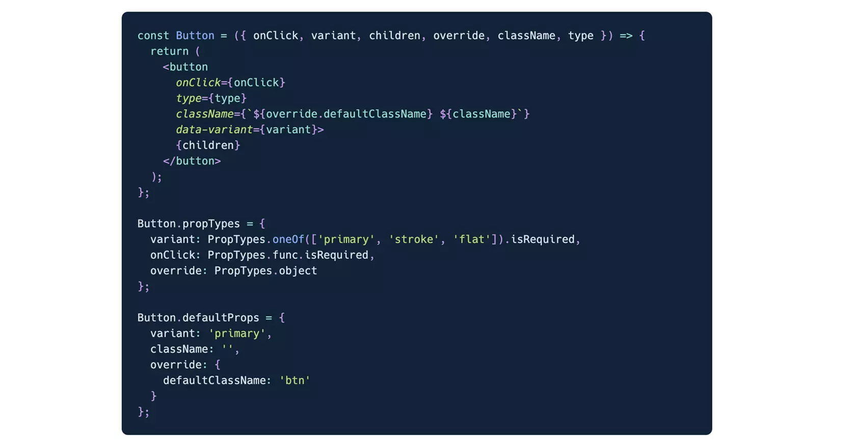
At the top, we see our actual component. In the return statement we see what UI is being generated, but we can also see how to apply the props. More importantly are the Button.propTypes and Button.defaultProps in this case. The former is a way in React to describe the types of the values we expect of each of the props and if they are required. For the variant prop we also see that we restrict the values it can have.
With defaultProps we define some default values used by the component. Using default values is a good way to avoid unwanted side effects when someone uses our component. When you do not define className, you will get undefined as a result. But because set a default value to an empty string, this empty string will be used instead of undefined. This avoids potential side-effects when someone creates a CSS class called undefined.
One of the props that might seem weird is override. Let’s say you use a default class name for your buttons called .btn. Although it is a sensible and good name, other developers working on different projects might use a different default class name. In the override props you can to override some default internal variables typically used. Ideally, it is hardly used, but it’s an easy way to make your components more powerful for others to use. As a developer though, you do not want to set override.defaultClassName every time. In this case, you can create a new component that wraps our Button component. This avoids the need for the other developer to know the internal logic of our component.

Now what?
Interfacing your components is hard. Other developers using your UI component might not be interested in the internals of it. Still, ensure that they realise how they can use and interact with it. In the end, they influence the users’ interface, the UI. Users also need to understand how they can interact with our components. When trying to achieve this, start small (e.g. naming convention of APIs). From there, you can expand and find better ways of interfacing than described in this post.